Project Summary
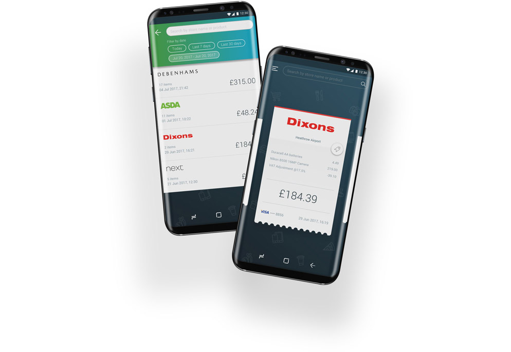
Iris is an app where consumers can opt to receive digital receipts for their retail, food, transport and banking transactions. For businesses, it eliminates the monetary and carbon-footprint costs associated with printing paper receipts and supports them to move towards digital transformation. I played the role of a UX consultant in planning and preparing for user research, created wireframes and prototypes for user testing, and visual elements for the product's MVP.
The Challenge
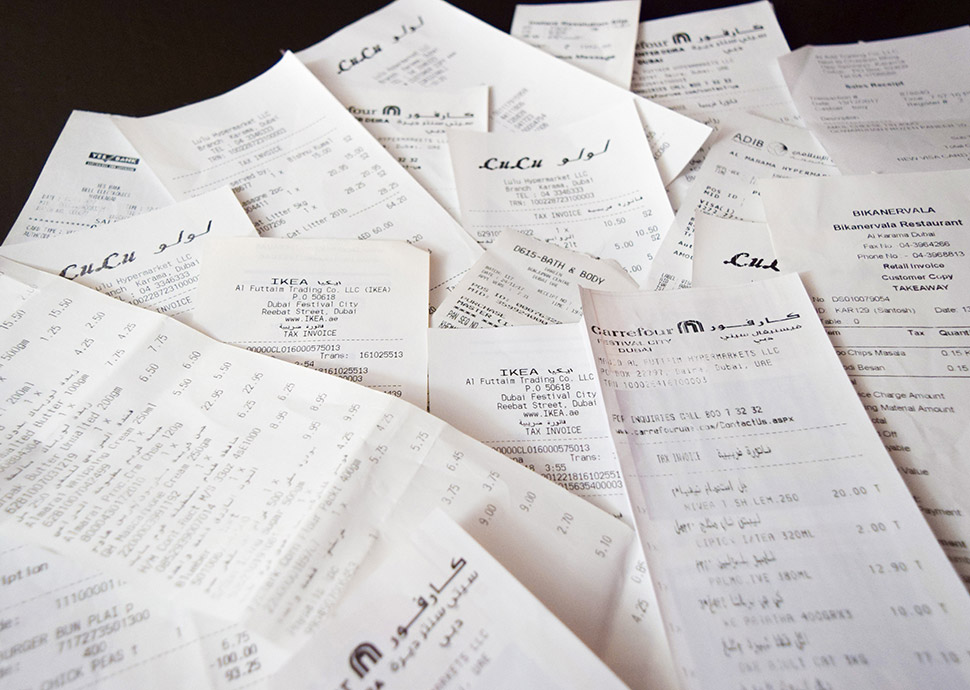
Paper receipts are a common sight at every retail touchpoint, with a piece of paper acknowledging the purchase of a product or a service. The outdated technology continues to be part of every transaction, primarily influenced by banking and financial institutions using traditional systems. The material and printing costs unnecessarily add up over the years for businesses and also increases their eco-footprint. End-users have to undergo the hassle of safely storing a large volume of receipts for potential returns, or having to dispose of them. The challenge was to create a new way to manage receipts and then integrate the technology into existing shopping and business behaviour.
The Approach
We started our approach with some initial user surveys. We asked people about their daily shopping routines, how they felt during the checkout stages, what they didn't enjoy and what they wished could have improved their experiences. I prepared various scenarios from the existing user research surveys to understand events that can play out at a checkout counter. There were some scenarios we had not considered before conducting the surveys. The scenarios also assisted in validating the flow and usability of the app in later stages.
I researched the processes and systems of 4 competitors to identify best practices, build on domain knowledge, and recognise their shortfalls. We looked at why other businesses failed at previous attempts and used that knowledge to understand our limitations and weaknesses. We determined what factors were critical to consider, and also how to ensure
the product would be universally adaptable
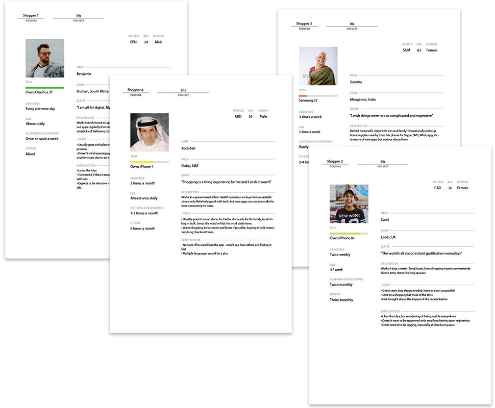
I prepared personas of core consumers that shared similar behaviour patterns using survey data. By grouping people into personas, it became easier to understand the set of people who would possibly be using the app during their retail checkouts. The personas would better explain their motivation, behaviours, and actions at the store. It became imperative that we would have to cater to various types of users - from power users to those concerned about downloading apps on their smartphones.

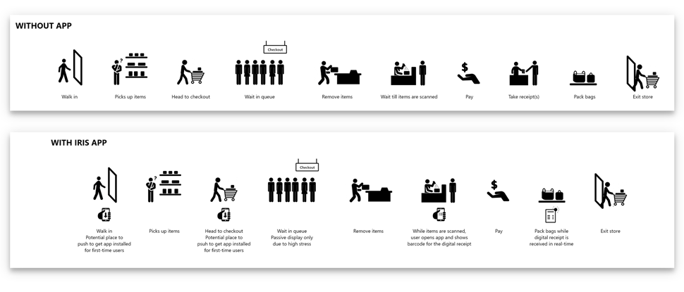
I then created journey maps to understand how various personas would behave through their retail experience, their thinking and their pain points, and the number of tasks they would need to perform to achieve their goal. We understood that the app would have higher acceptance levels if it reduced or removed some of the pain points. Previous attempts by other companies seemed to have failed because they added more tasks at the checkout, becoming counterproductive in driving change.
Design
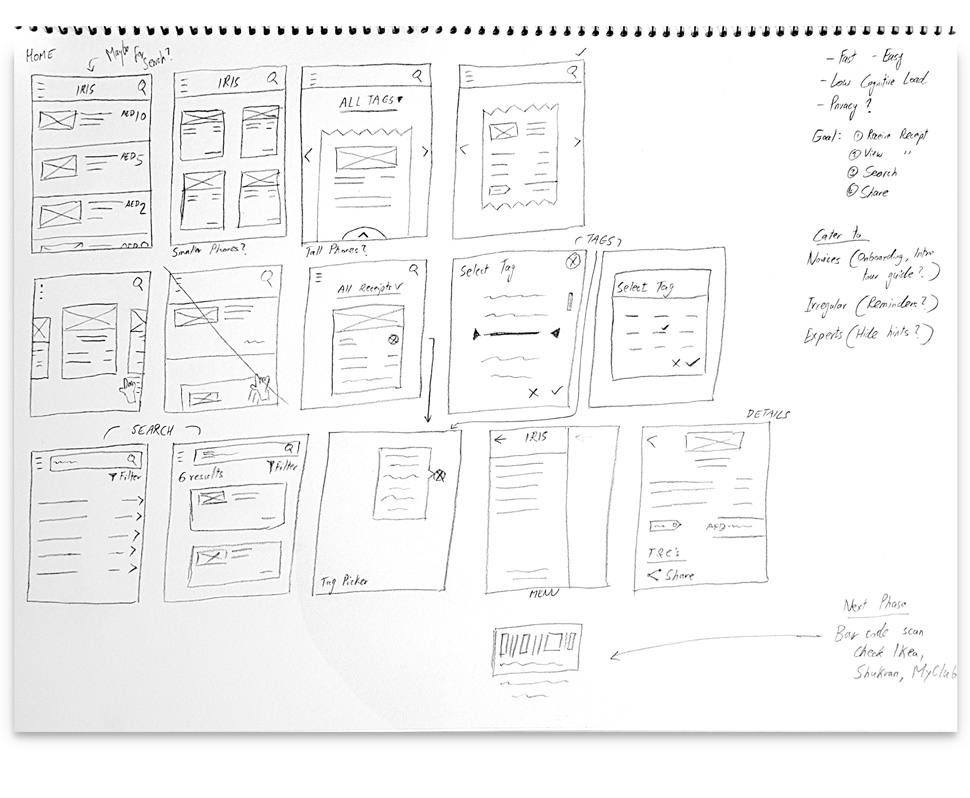
The team got together to brainstorm ideas by creating sketches on paper and discussing their practicality. I then translated these ideas into low-fidelity wireframes in Adobe XD, while accounting for user expectations (e.g., fast navigation and quick searches) and business objectives (e.g., easy to use and simple learning curve). Unstructured user tests helped us make iterations and improve user flows for different personas.

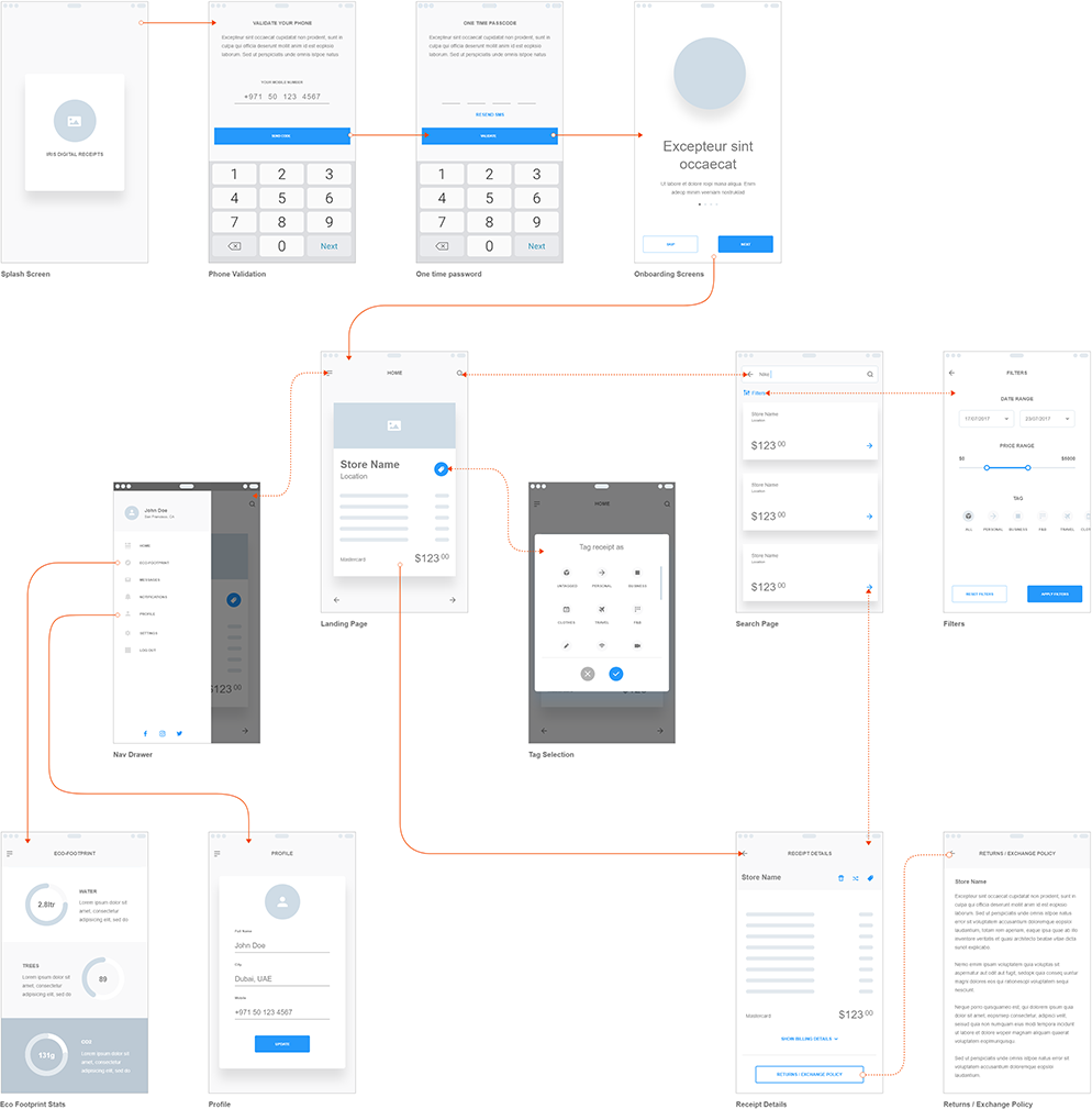
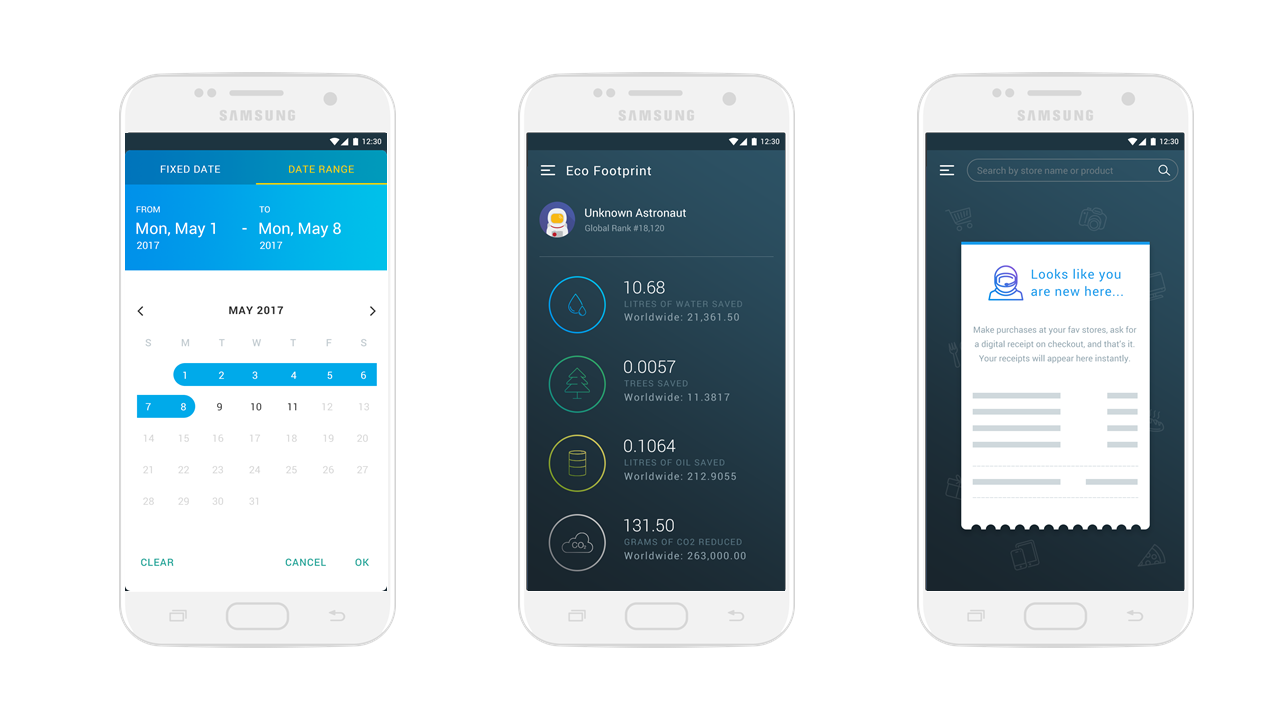
Using inspiration collected in our moodboard, I then created low and high-fidelity prototypes using Photoshop, Illustrator and Adobe XD. Interactive prototypes were built using Invision, and my team ran user trials at coffee shops, hallways, and even the neighbours. With the feedback and a couple of iterations, I moved to design the interface design.

After creating the UI designs, I prepared the necessary design documentation to ensure consistency and guidance about the interactions. Design assets such as icons and images were then extracted independently for the iOS and Android developers. During the development phase, I regularly communicated with the offshore developers to ensure there were no gaps in the product while being developed.



Learnings & Outcome
I learned a lot of new things working on this app, which deceivingly looked like a simple product to build and launch. It involved a lot of research, analysis, designs, and user trials to even reach an MVP. A complex backend system had to be built from scratch to handle large volumes of information being exchanged with the real-world while ensuring speed and durability for better user experiences.
The product owner largely contributed to the initial requirements for the app, mainly based on self-knowledge and experiences. However, research revealed a plethora of user behaviours and experiences that we might have missed. The most challenging part of the project was managing time delays and communication with the offshore development team. Since multiple developers were involved in the project at different times, it caused delays which could have been probably reduced by assigning dedicated iOS and Android developers.
The app is currently undergoing pilot phase trials across some retail stores in the UK for feedback from consumers, businesses and POS developers. The product roadmap includes several new features and improvements for the future. I enjoyed working with the tightly-knit team where we could bounce off ideas and concerns to ensure that each aspect of the app was considered for better user experiences.

is a UI/UX designer with a background in business psychology, looking to bring about a positive change through design. Strongly believes that design is not just how it looks and feels, but also how it works and how the user interacts with it.